Graphs using free math software
By Murray Bourne, 02 Feb 2010
[Updated Dec 2016.]
Being able to sketch graphs on paper is an important skill, but I'm wondering about the future of this. There are now many free (or cheap) graphing tools available and I am surprised so few students actually use them (or are allowed to use them).
Let's have a look at some of the available math graphing tools.
Graphics Calculators
Here are the Texas Instruments TI-83 (left) and Hewlett-Packard HP 40gs (right) calculators.
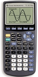
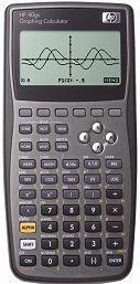
Graphics calculators are handy, but the screen size is small and there is usually no scale on the axes. Cost is often prohibitive, at around US$100.
Online Graphers
Here's a few places where you can graph your curve - for free!
My favorite in this space is:
Don't miss The Daily Desmos for some cool graphs.
The next example uses Scalable Vector Graphics, right here on IntMath.
For another grapher based on a well-known SVG grapher, see: JSXGraph function plotter.
The following are also free offerings (some suggested by readers). I've presented them roughly in order of preference.
- Wolfram|Alpha (produces a graph image, which can be converted to CDF interactive if you have the pricey Mathematica)
- GraphSketch.com (image-based)
- Good Calculators (canvas- and javascript-based)
- GraphFree (image-based)
Downloadable software apps
Here are some of my favorites. In each case you need to download and install the software.
- GeoGebra (Free. I wrote a review of GeoGebra which shows how to get started with it.)
- Graph 4.4.2 (Free. Small download, from cnet.com)
Requires payment:
- Scientific Notebook (US$90, but does much more than a graphics calculator. It's a full computer algebra system, but much cheaper than MatLab or Mathematica, etc.)
Some problems with using graphics software
If you don't have a good idea of what a function should look like before your use a graphics package, you can have all sorts of problems.
Here's an example of a function which catches out the unaware.
![]()
Let's graph it on Geogebra.
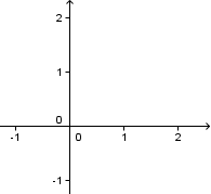
Hmmm - it appears to be empty. Is there an error? What's going on?
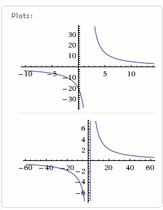
We zoom out a few times and start to see 2 curves. Once again, is there a mistake? Why 2 curves?
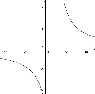
I zoomed out because I had a good idea in my head what the graph should look like. Since I couldn't see either of the 2 arms of this curve, and because of the 30 in the denominator, I knew I had to zoom out.
If I left my graph at that, I would still not have a good idea of what the function looks like. I have not chosen a view that shows the crucial features of this graph.
The default view in Geogebra was too close to the origin (0, 0) to see any of the curve.
Let's have another go, this time using Scientific Notebook. This is what I get when I try to graph the curve.
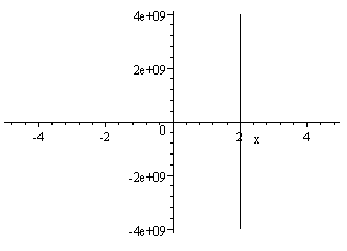
I get a vertical line passing through 2 on the x-axis. But notice the scale on the y-axis. The number "4e+09" actually means 4 × 10⁹ or 4 billion. So Scientific Notebook recognizes that there are very large values of y involved in this function, and has shown us the limits of its internal coding.
This time if we zoom in, we can start to see the graph appearing as before. But I need to know to zoom in, otherwise I would miss it altogether.
What was that vertical line that appeared before? Was it a mistake? Why did it disappear when we zoomed in?
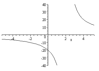
Next, we use my SVG Grapher. It's similar to Geogebra in that its default view misses the curves, but is also similar to Scientific Notebook in that it shows a vertical line through 2 on the x-axis.
When we zoom out a bit, this is what we get.
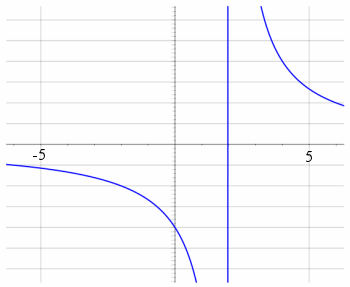
We are still not showing all the vital features of the graph, and that vertical line is still there. What's that about?
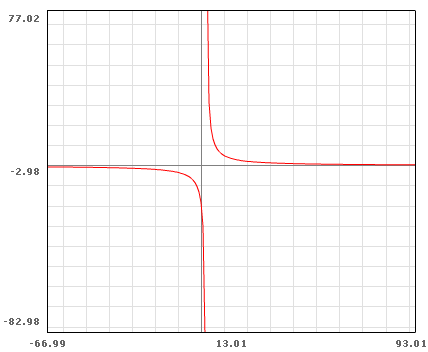
Next, I tried the Flash Math Grapher. Once again I needed to do some zooming. The x- and y- scales are strange (multiples of 13.01??, and is that the x-axis or the line y = -2.98?) , but at least I can get a pretty good view.
Next, let's call in the big guns. Wolfram|Alpha gives us the following 2 graphs when we put our function in their search box (and they give us a lot more information about the function).
This time we get intelligent graphs that have appropriate x- and y- scales and actually show the curves. Note the first one does not have a vertical line through 2, but the second one does. Why?
That vertical line through x = 2
When the software draws the graph, it chooses regularly-spaced x-values and substitutes them into the function, plots the resulting dots and joins them.
In the above examples that have a vertical line, it means the software has chosen a value just slightly less than 2 (which will give a very small, negative value for y) and another one just slightly more than 2 (which gives a very large positive value for y).
Here's an exaggerated version of what it's doing (using only a very few data points joined by straight lines).
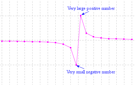
If the x-value chosen is exactly 2, the software will normally just skip that value (since it will return a "division by 0" error). The (almost) vertical line should not be included in the graph, since we cannot have x = 2 (this function is undefined for x = 2 since the bottom of the fraction would be zero).
This gap in the graph is called a discontinuity. It should be a gap - not joined by a line as above.
Some software handles this situation gracefully (like the Wolfram|Alpha example) while in others, you need to either understand why the vertical line is there, or in some cases, you can elect to include discontinuities or not.
Best answer
Here's probably the best way to display the graph of this function.
Our graph has 2 asymptotes. When a curve gets closer and closer to a line but does not touch it, that line is called an asymptote
The first asymptote is the x-axis and the other is the vertical line, x = 2, which I drew using a dashed line of a different color (since it is not part of the graph).
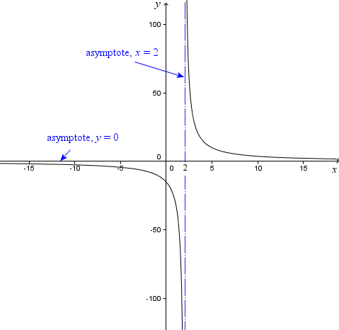
I have shown the 2 asymptotes clearly and I have also labeled the x- and y-axes.
Here's the function again for convenience.
![]()
I knew the graph was going to involve asymptotes since the x-variable is in the denominator (and we can't have 0 in the denominator) and also considering when x gets really big, the value of the function will be really small.
If I didn't know this (from graphing many of them on paper), I would have made a mess of graphing my function on a computer.
Graphing software and the future
Will graphing software change what we do in classrooms? Should it? Is it really necessary to sketch graphs on paper still?
If you can draw a quick sketch of a function on paper, it certainly helps your understanding for many types of math problems. The conclusion from above is that it is certainly worthwhile to have a good sense of what a graph should look like before graphing it using software, so we can manipulate the settings to show the graph properly.
See the 23 Comments below.
2 Feb 2010 at 9:50 am [Comment permalink]
I'm going to try to find a way to file this so I'll be able to find it many months from now, when I want to show it to students. Thank you!
2 Feb 2010 at 6:04 pm [Comment permalink]
A small tip from a Norwegian GeoGebra user. I think this feature was included in GeoGebra after a tip from one of the GeoGebra resource persons at a meeting at our GeoGebra institute.
Right click the canvas and select "Show all objects". A nice way to avoid the "hunt the graph" activity. (Unless that activity is wished for....).
2 Feb 2010 at 9:46 pm [Comment permalink]
I graduaed 52 years from Rice University and hardly remember what a determinat is. Going through your program carefully, things have sddenly been restored to my memory. Advanced differetial equations remain a blog hidden in my mind. I was very good in mathematics and do not consider this a daunting task. Curtis McKallip
2 Feb 2010 at 9:48 pm [Comment permalink]
Hi Curtis. I'm glad it's been helpful to you!
2 Feb 2010 at 9:50 pm [Comment permalink]
Thanks for the tip, Oistein. I tried it with the hyperbola example and depending on the starting conditions, it often only showed one arm of the hyperbola. So perhaps it wouldn't help the graph hunt activity in all cases!
I like your blog - we appear to have similar interests. How are things in Norway?
4 Feb 2010 at 2:04 pm [Comment permalink]
this is very usefully for the application in sciences and engineering
4 Feb 2010 at 4:34 pm [Comment permalink]
Thanks for visiting my blog, I am afraid the updates occur more and more infrequently... I have a Norwegian one that is a bit more up to date.
You are right about the "show all objects" in GeoGebra, probably such a feature can't be made if it has to cover all types of functions and objects, so I think it does the job well. The GeoGebra teams have some cool plans of making a collaborative version, CAS version, 3D-version etc... Great for education.
BTW, I think the "chase-the-graph"-game was being formalized into research by an article by Artigue (on CAS) around 2002, but can't remember the title.
Love reading your blog, keep it up!
10 Feb 2010 at 2:05 pm [Comment permalink]
The 'Graph Explorer' at http://qpr.ca/math/ allows you to enter an expression like '1/(x-a)' and watch the graph move as you drag a slider. (And the lab at http://qpr.ca/math/labs/spikes&spears/ uses an older version of the same program to eplore more properties of the graphs of rational functions).
I hope you don't mind me adding a plug for my own efforts here, but even though the latest version is almost ten years old I think it does have advantages (for some purposes) over some of the options listed above.
10 Feb 2010 at 8:19 pm [Comment permalink]
Thanks for the resources Alan - and good to hear from you.
16 Feb 2010 at 10:08 pm [Comment permalink]
hey these r xxxlent.its useful fr b.tech students.plz send me some oharmacy softwares n material.plzz
24 Feb 2010 at 9:54 pm [Comment permalink]
Please, I will like Fourier in a more simplified way please is very urgent
25 Feb 2010 at 2:20 pm [Comment permalink]
You can see a chapter on Fourier here: Fourier Series.
25 Feb 2010 at 3:02 pm [Comment permalink]
Here's a visualisation of Fourier Series in action:
Update: Geogebra changed their links and this is no longer findable...
Change f(x) to alter the function (many different expressions work here, but not all, and some will cause a lot of processing!) and drag n to see the series approach the function.
4 Mar 2010 at 7:23 pm [Comment permalink]
I’m very pleased to have found your blog: filled with all of my favourite education hubs.
I have been meaning to tell you about a new maths resource that is one of my new favourite links, Mangahigh.com. Although the site is new, it has a lot to offer and new maths games are being added frequently.
I have been using it in the classroom and for homework. A great teacher’s resource they have put together is a lesson plan guide: https://www.mangahigh.com/en-us/
14 Mar 2010 at 11:50 pm [Comment permalink]
The blog written about me (Curtis McKallip) is basically true but I was not the author. The poor spelling (grauated) is even typical of my dyslexia. Who wrote it? Curtis McKallip
15 Mar 2010 at 11:39 am [Comment permalink]
Hmm - the "other" Curtis McKallip wrote from an IP address in Puerto Vallarta, Mexico. Both of you used the same email address.
Strange. Will the real Curtis McKallip please stand up?
20 Mar 2010 at 12:19 am [Comment permalink]
The blog attributed to me but not written by me had to have been writ ten by Joe Hogel who is a good friend of mine and was vacationing at the same place in Mexico as I. The real Curtis McKallip is standing up. The sail in my address is there because I sailed most of my life.....at least 75 years of my 85. Curtis McKallip
10 Jun 2013 at 12:10 am [Comment permalink]
You may want to update the list of online resources. Desmos.com is a lovely online graphing calculator. Your readers might also appreciate knowing about dailydesmos.blogspot.com.
10 Jun 2013 at 8:25 am [Comment permalink]
Hi Sue. Yes, I've been a fan of Desmos since it first appeared. I wrote about it in one of the IntMath Newsletters. You are right - the post needs an update.
Thanks for the tip about the Daily Desmos.
14 Jul 2013 at 10:46 am [Comment permalink]
@Sue: I finally got a chance to update this post just now. Thanks for the nudge!
7 Apr 2015 at 7:39 am [Comment permalink]
Might I suggest a new addition to the list? I spent my last summer vacation creating GraphFree (www.graphfree.com), and now I use it regularly to make the graphs for my own calculus and precalculus tests. Some of its more distinctive features are the ability to create slope fields and a convenient interface for piecewise functions. Of course, the more standard capabilities, like parametric, polar, conics, etc. are there too. It's completely free, and I hope your readers can get some use out of it too.
9 Dec 2016 at 10:26 pm [Comment permalink]
Hello,
I like those sites in your post. In particular, IntMath is fantastic resource.
Since I'm experienced math teacher I also decided to create something that helps students in math.
So, I created some calculators that allow people to check their work.
The most popular is online graphing calculator:
http://goodcalculators.com/graphing-calculator/
I'd be very grateful if you'd consider adding them to your page.
10 Dec 2016 at 9:14 pm [Comment permalink]
Hello Andrew: Thanks for sharing and I agree they belong in my list. I've added it!