What does Japan’s history tell us about the DJIA’s future?
By Murray Bourne, 06 Sep 2010
The Dow Jones Industrial Average (DJIA) is an index comprising the largest 30 companies on the New York Stock Exchange.
It's an important indicator of how "the market" regards the future of those companies, and by extension, the future of the broader market.
Japan had a booming economy right up to the end of the 1980s (when I lived there). It's stock and financial markets grew exponentially and were at lofty heights but have spiralled down ever since. Now, of course, China has overtaken Japan as the second largest economy in the world.
Japan has a massive debt burden from all its unsuccessful pump-priming of the economy.
Meanwhile, the US economy had steady growth until the dot.com boom of the late 1990s (which crashed). It fell because of September 11 and the Iraq invasion. And it crashed again as the Global Financial Crisis took hold in late 2008.
Comparison of Japan's Nikkei and DJIA
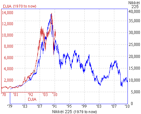
In the following chart, I have compared Japan's Nikkei 225 (from 1979 to Sep 2010, in blue) with the DJIA from 1970 to Sep 2010 (in dark red).
We can see the growth pattern was very similar, as was the plunge after the boom.

So will the DJIA follow the Nikkei down?
Time will tell, but with the huge debt burden of the US, and its expensive military reach around the world, it could well follow Japan's lead.
The growth in the 2 markets (up to their peaks) are examples of exponential growth, while Japan's rout is looking like exponential decay.
For more on this, see Dow Jones Industiral Average Model.
See the 7 Comments below.
6 Sep 2010 at 11:00 pm [Comment permalink]
You're cheating a bit by using different time scales and a y-axis whose meaning changes with time (since the underlying dollar does not have constant value).
Perhaps you should deflate each by the value of the dollar or yen at the time. I think you'll find that the "exponential" grown of the DJIA is not very fast and reflects more the change in the value of the dollar than anything else.
7 Sep 2010 at 9:20 am [Comment permalink]
Hmm...
The different time scales are necessary for the comparison to make sense. The point is, both markets grew exponentially for some years, hit a peak and then crashed. Whether a crash takes a month or a year, it is still a crash. Similarly, exponential growth can be observed over periods of days, months or years. We all know how fast things move in the US and how Japan is a more conservative country. It is not surprising the booms and busts are compressed in the US.
You are right, the underlying dollar does not have constant value. My underlying point here is that financial advisers love to point to growth charts to push their products ("the market always goes up, despite hiccups along the way"). So it is certainly relevant to use non-inflation adjusted charts.
However, my point is still valid. This is an inflation-adjusted chart for the DJIA since the beginning of 1988:
[See the full chart: source]
Exponential (even considering inflation), yes. A good investment? Probably not.
[You can see a chart here: inflation-adjusted chart with logarithmic vertical scale [no longer available], which also demonstrates the exponential growth (a straight line with positive slope on a semi-log graph indicates exponential growth). The writer points out that after taxes and inflation, the return is about 1.1%.]
7 Sep 2010 at 12:55 pm [Comment permalink]
The inflation-adjusted chart with a log vertical scale looks to me like the right way to present the data. Can you get a similar plot for the Nikkei index (using Japanese inflation rates) and superimpose them?
8 Sep 2010 at 5:55 am [Comment permalink]
@gasstationwithoutpumps: Murray isn't "cheating" - this is a valid comparison between the world's 2 largest economies (at the time).
So what if the time scales are different? It would be very strange if they were the same.
And why is the log vertical scale the "right way" to present the data? It is actually harder to see that it is exponential, unless you have some familiarity with semi-log graphs.
Thanks for the interesting article, Murray!
8 Sep 2010 at 7:15 am [Comment permalink]
Exponentials should be shown on a log scale, because people only really understand straight lines on graphs. All "rapidly growing" curves look alike, even if they are really quite different power laws or rates.
Changing the time scales in finance means that you can match just about any rise or fall to almost any other, making the comparison rather meaningless.
16 Oct 2010 at 9:37 am [Comment permalink]
The last commenter (who actually appears to be full of gas) wrote:
"Changing the time scales in finance means that you can match just about any rise or fall to almost any other, making the comparison rather meaningless."
Clearly he has no understanding of financial charting. There are many clearly recongnizable chart patterns that occur over various time scales (head and shoulders, rising and falling trends, pennants, and the like).
Rather than being meaningless, such comparisons can give us a good sense of how the market feels and sometimes, an indication (with a reasonable probably) of what might happen next.
18 Oct 2010 at 9:42 pm [Comment permalink]
It is well documented that people are quite capable of imagining patterns in random data. The financial charting people are quite good at it.