Dow Jones Industrial Average (DJIA) Model
The Dow Jones Industrial Average (DJIA) is a weighted average of 30 of the largest stocks on the New York Stock Exchange. It is a very important barometer of the health of the US economy and has a large influence on stock markets around the world.
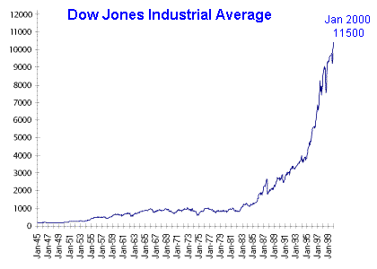
When we look at a graph of the DJIA from 1945 to 2000, we notice it is close to the exponential growth curve that we met in the last section.
Updated: Sep 2011
See later on this page where the model is updated taking into account the global financial crisis and subsequent volatility.
Related Section
Don't miss the Money Math chapter, which has sections on interest, home mortgages, Fibonacci and gold.
It can be useful to model the shape of the curve so we can make a prediction for the future direction of the curve. (As we see later, this is a dangerous thing to do, but interesting, especially if we want to be rich.) A "model" is just a fancy word for a function (or formula) that closely matches some observed data.
Exponential Model
Let's just consider one portion of the Dow Jones index, from 1980 to 2000, where dramatic growth occurred. We can model this curve using an exponential function.
The first step is to obtain some data values. The following are the DJIA closing values on the last trading day of the years indicated:
`1980` `963` `1985` `1546` `1990` `2633` `1995` `5117` `2000` `10787`
The plot of this data is as follows:
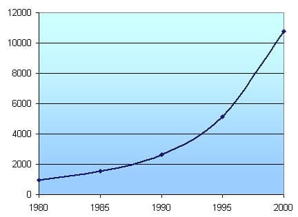
We observe it is a similar curve to the exponential growth curve that we met before. As time goes on, an exponential growth curve gets steeper and steeper.
We use Excel to find a model describing this trend, and find the DJIA value (y) in year x is given by:
y = (2 × 10-101)e0.1206x
(See below for an explanation for how to use Excel to produce a trend line.)
Dow Jones Prediction - based on data to Jan 2000
In Excel, you can use the model to make a prediction (see the "Options" screenshot above). I have predicted what will happen, given the same growth rate, out to 2010:
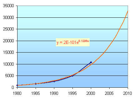
This is called extrapolation, where you continue trend lines outside of the given data.
This indicates that if we had invested `$10,000` in 2000, we can expect to have about `$33,000` in 2010. Good deal!
But wait, will it continue to go up like this? Let's look at what really happened.
Update - Sep 2011
Here is chart of the DJIA up to 23 Sep 2011.
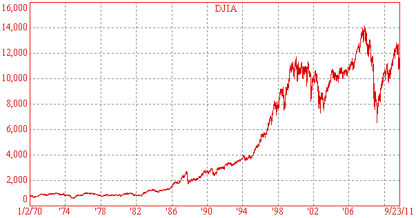
The DJIA has been volatile since the peak of early 2000. There was a plunge after the September 11 terrorist attacks on the US in 2001 and it plunged even further before the Iraq war started in 2003. However, the Dow recovered all of the lost ground and peaked on 9 Oct 2007 at 14,163.
Then, the financial crisis wiped more than 50% off the value of the DJIA by 9 Mar 2009, when it closed at 6547. Since then it has recovered to over 10000.
It is clear that predictions based on past performance are very dangerous since our original model (above) predicted that the DJIA would be at about 23,000 by the end of 2006 and over 30,000 by the end of 2010. Yet at the time of writing (Sep 2011), the Dow is sitting around only 10,800.
Updated Models
Assuming Growth Will Continue
Financial planners are an optimistic crowd and try to tell us that the market will eventually always go up. If we assume they are right, here's an exponential model of the DJIA that uses all data points from 1st Jan 1970 to 23 sep 2011.
I have extrapolated the data out to 2020, to see how it might look.
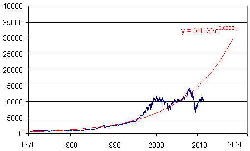
We see that the growth was indeed quite consistently exponential until about 1995. The "dot.com boom" of the late 1990s was not sustainable and the market returned to more normal growth from the lows of 2003 to the high of 2007. It appears that the 2008 financial crisis has meant that prices have fallen too low and given time, the economy will recover along the path to long-term growth and the DJIA will snap back to its normal trend line.
By 2020, the model predicts the Dow will be at around 30,000.
Of course, we will only see such growth in the market if the US economy is in good health and grows as it has done in the past 40 years. However, there are many factors involved (including the unravelling of the credit crunch, and the large numbers of people moving into retirement from now to 2020), so don't be too hopeful.
In fact, there are several other possible outcomes from here. One is the market will move in a range like it did during the 1960s and 1970s.
Another scenario has the DJIA following the Japanese experience and going into a very long decline.
Let's Turn to Japan...
In the late 1980s, Japan had explosive growth in sharemarket prices, similar to the DJIA in the late 1990s. The euphoria in Japan was driven by healthy export growth, but especially by a housing and construction boom. The real estate bubble burst in the early 1990s and the Japan market started to plunge. Japan has been in and out of recession ever since, and the latest stock meltdown from late 2007 has seen the value of the Japanese stock market return to values last seen in early 2003, and before that, in 1983.
Investors who were in the market during the 1980s did very well, but since then, many people have lost a lot of money.
The main stock market index in Japan is the Nikkei 225, which is an index of the top 225 companies in Japan, something like the DJIA in the USA.
The graph of the Nikkei 225 from 1967 to 22 Sep 2011 is as follows:
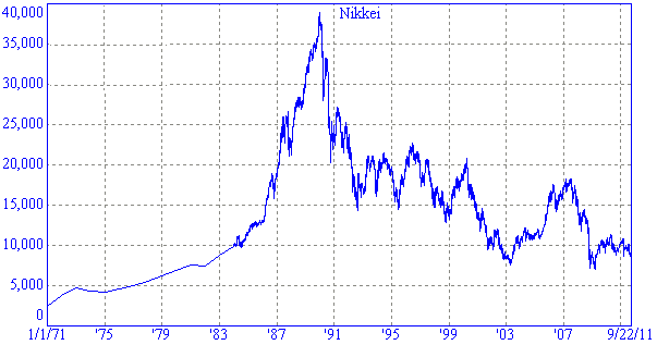
The early part of this chart is quite similar to the exponential rise of the DJIA and it is interesting that both stock bubbles were in part fuelled by real estate bubbles. If the DJIA unwinds over the next 20 years in a similar fashion to the Nikkei, we might see a return to values last seen in the 1980s.
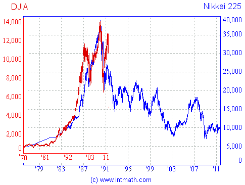
In this next graph, I have superimposed the DJIA (in dark red with red scales) and the Nikkei (in dark blue with black scales). The period from 1970 to the peak in 2007 for the DJIA has a remarkably similar shape to the runup for the Nikkei from 1977 to its peak in Dec 1989.
The wipeout that followed the peaks is also very similar. The Dow's low of near 7500 in Oct 08 corresponds to the Nikkei's low of around 20000 in late 1990.
Since its peak, the Nikkei has basically been on a downward spiral.
Here's an exponential decay model for the Nikkei, from its peak at end 1989 to the end of August 2010. (Note the negative in the exponential term.)
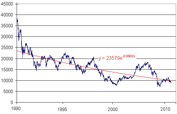
So will the Dow follow the Nikkei's pattern over the next 20 years?
We hope not, but if so, we can expect the DJIA to be somewhere around 2000 to 3000 at that time, or about 30% of its current value (as at Sep 2011). That will make a lot of retirees seriously unhappy.
Related Section
Don't miss the Money Math chapter, which has sections on interest, home mortgages, Fibonacci and gold.
Many commentators are saying that the Japanese did not address the issues regarding bank disclosures early enough in the 1990s and that's why their economy has never really recovered. However, the US Federal Reserve has already reached 0% interest rates (like the Japanese did) and have nowhere else to go now except for stimulus packages (like the Japanese have been trying, with little success, for 20 years.)
It's telling that the size of China's economy has overtaken Japan's. Nothing is forever, and one wonders what the future holds for the US economy.
Don't ever believe professional financial experts who tell you markets always go up.
Past performance is not a guide to future returns, as can be seen from the above updates! Think about your investments carefully. But don't give up on investing - it is arguably the most important application of mathematics that you will ever do...
How to produce trend graphs in Microsoft Excel
Using Excel, we can add a trend line to our data and in the process, find a model. If you right-click on your Excel graph (not the background) you will see the option "Add Trendline...", like this:
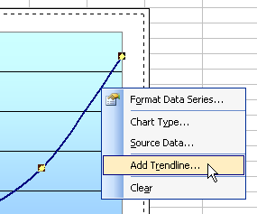
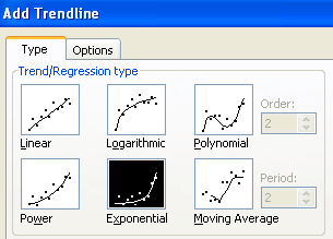
Choose "Exponential" for the Type and then click OK.
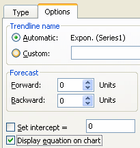
In "Options" check "Display equation on chart" (this is the model, or equation, that we want).
We now get the following chart, showing the data points and the exponential graph model:
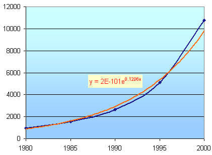
We see that the exponential curve (orange) passes closely through our data points.
That model may need some explaining.
2E-101 means `2 × 10^-101`. This is a very small number indeed. "E" here means base `10`.
e0.1206x is the exponential function with base e, which we met in the section Natural Logarithms.
So the graph is y = (2 × 10-101)e0.1206x, where x is the year (in this case, `x > 1980`).
What did Excel just do for us?
The model that Excel produced for us is based on the following process. Since it is obviously an exponential growth curve, we are looking for a curve in the form
y = mex + b,
where y is the value of the DJIA, x is the year (starting at 0 for 1980) and we need to find the constants m and b.
We use the following formulae (as used in statistics) and subsititute in the values from our data table.
`m=(nsum(e^xy)-(sumx)(sumy))/(nsumx^2-(sumx)^2)`
`b=((sumx^2)(sumy)-(sumxy)(sumx))/(nsumx^2-(sumx)^2)`
The calculations are pretty horrible - it is best to use a spreadsheet program to do them. But then, use Excel as I did above and it finds the model for you in one step.
Using Excel's built in trendline, you can specify what the y-intercept is for the exponential curve (this will affect the value of b). I used the default setting where b = 0.