New z-Table interactive graph
By Murray Bourne, 03 Feb 2014
I recently added a new interactive item to the Counting & Probability chapter:
Normal Probability Distribution Graph Interactive
You can use this applet to investigate what the z-table values actually mean.
In statistics, when we plot the distribution of a measurement (say, the heights of people) we very often produce the familiar bell-shaped curve.
For example, the mean (average) height for males in the US is 175.5 cm and the standard deviation is 7.4 cm. When we plot the heights of US males, we get a bell-shaped (also known as Gaussian) curve. We know that around 68% of US males have heights between 168.1 cm (one standard deviation below the mean) and 182.9 cm (one standard deviation above the mean.
However, it is difficult to work out probabilities and proportions when the mean and standard deviations are different for each type of measurement.
The solution is to standardize the measurements which means we translate the mean to 0 and the standard deviation to 1. When we graph this resulting distribution, we get the standard normal curve. We can use a z-Table to find probabilities of certain events occurring. The z-Table tells us the area under the standard normal curve for particular values of interest, thus telling us the probability of an event.
The applet
The applet allows you to vary the mean and standard deviation, and upper and lower boundaries of the region of interest.
Here's a screen shot:
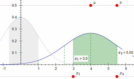
You can also see the calculations for your particular values.
For the geeks
This math applet uses JSXGraph, jQuery and MathJax. It works on tablets, albeit a bit slow. One of the challenges when developing this was to make it as efficient as possible.
The link again: Normal Probability Distribution Graph Interactive
See the 4 Comments below.
5 Feb 2014 at 3:27 am [Comment permalink]
Thanks Murray!
This is really great amd useful...
Q:
Any chance to apply your magic skill,
to also have this type of visual calculators
for OTHER types of Distributions (ie: Binomial, etc)?
6 Feb 2014 at 9:13 am [Comment permalink]
@SFDude: Glad you found it useful. Good idea to do the other distributions - I've added this suggestion to my (already quite long) list!
20 Apr 2016 at 1:41 am [Comment permalink]
Hi again Murray (after 2 years+ !)
This applet is GREAT.
btw,
small typo in text:
175.5-7.4=168.1 (not 171.1)
but maybe I missed something...
Thanks for your most wonderful Newsletter.
Have a great peaceful day! 🙂
SF
20 Apr 2016 at 7:21 pm [Comment permalink]
Hi SF
Good catch! I have amended the post.
Oops - I see that I still haven't extended this to other distributions yet. Shame there's only 24 hours a day...
Regards