Earth killer - composite trigonometry CO2 graph
By Murray Bourne, 09 Feb 2008
Scientists have known for years that the amount of carbon dioxide in the atmosphere has been increasing.
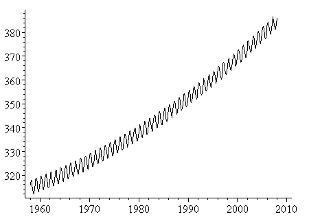
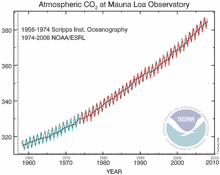
The observations on the top of Hawaii's Mauna Loa volcano have shown a disturbing rise in CO2 over the last 50 years.
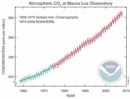
Image source: National Oceanic & Atmospheric Administration
The black line on the graph represents mean data for each year (with some allowance for missing data points). The green and red oscillating lines are the result of natural "breathing" by the Earth throughout the year. In winter, when leaves drop and people burn coal, wood and oil for heating, the CO2 goes up. In summer, as the leaves reappear and there is less fossil fuel burned, the CO2 concentration drops. (This is Northern hemisphere, of course. There is less CO2 in the Southern hemisphere due to lower population, but the pattern will be similar.)
This graph reminded me of a function that I created as an example for this composite trigonometric graphs page. (It's Exercise 1 on that page, the curve y = x2/10 − sin πx.)
So I thought it may be an interesting exercise to model NOAA's CO2 data (1958 to 2008 - original data no longer available) and try some extrapolation to see where we'll be in a few decades time.
A model here means an equation that connects the time variable (horizontal axis) and the concentration of CO2 (the vertical axis). Modeling is a very important concept in mathematical thinking, and unfortunately, most students never get to do any modeling, or even see it being done.
Extrapolate means that we will use the equation that we get to predict what will happen in the future (we can also extrapolate backwards in time.)
Climate modelling is probably the most important mathematics going on in the world right now.
Back to the story...
Using Excel to Model the CO2 Data
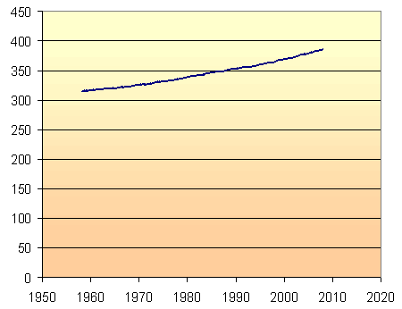
My first graph uses the full zero to 450 parts per million vertical scale, so that we can see that there is indeed a noticeable increase in CO2 concentration over the last 50 years. (In statistics, you can always exaggerate a trend by restricting the vertical scale. This is a common trick in advertising.)
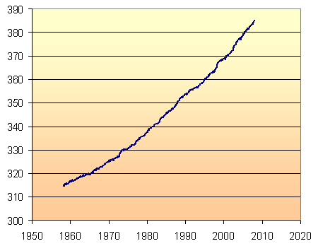
For the rest of the graphs on this page, I have restricted the vertical axis scale, so that we can see more clearly how well the models work.
Linear Model
The simplest model through the given data points is a straight line. Using Excel's "add trendline" facility, and choosing "linear", we get the following:
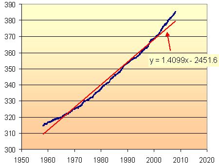
Excel has given us a "line of best fit", with the least variation from the data points. It is not a very good model. Clearly, the slope of the CO2 concentration is increasing as time goes on. If we tried to extrapolate beyond 2008, we would be under-estimating the amount of CO2.
(To see how to use Excel's "add trendline" facility, and for another modelling example, see DJIA Model.)
We clearly have a curve, rather than a straight line, and that curve is likely to be exponential, since CO2 concentrations are related to population growth, which is also exponential.
In summary, I'm looking for a curve that passes through most of the data points and clearly follows the trend.
Exponential Model
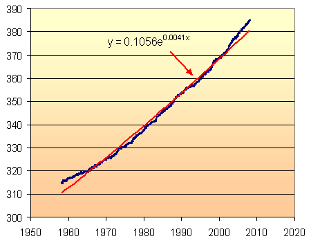
This is the model given by Excel and it is clearly not very satisfactory. It under-estimates at the beginning and end of the data series, and doesn't look much better than the linear model.
The problem, of course, is that Excel is making an assumption that the value at x = 0 (that is, at year 0) is a very small value (in this case, it has chosen 0.1056). However, we know (from Antarctic ice cores) that the CO2 was at a reasonably stable 280 ppm until the beginning of the Industrial Revolution.
There is no way (that i could figure out) to tell Excel to use 280 as a base line. So I subtracted 280 from each of the data points and used Excel to give me a new exponential model. Adding 280 to each of the model's values, gave the following result.
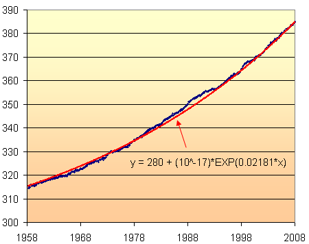
Actually, Excel's model was y = (1E-17)e^0.0216x which was close, but not good enough. I have tweaked this to give the graph of the model overlaid on the original data above.
Now we are getting somewhere. The model fits quite well with the data.
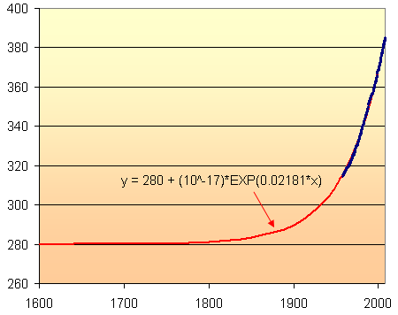
Here is a long-term view of the model, indicating the relatively stable CO2 levels (at 280 ppm) until around 1800 when the madness of coal burning began.
Yearly Oscillations of CO2
The yearly oscillations can be represented by a cosine curve, whose period is 1 year. The amplitude of the cosine curve is just over 3 ppm, derived from observation. There is a slight phase shift since the data actually starts in Jan 1958 and there is a lag before CO2 concentration reaches its peak for the year.
This cosine curve is simply added to the polynomial curve expression, as follows:
y = 3.07cos(2πx-1.2) + 280 + (10^-17)e^0.02181x
This graph (obtained using Scientific Notebook) looked quite close to the original NOAA data.
To check it, I resized and then overlaid the black model graph onto the original NOAA graph (green and red) and obtained:
I'm quite satisfied that the model is a good fit.
In fact, this model seemed good enough to use for extrapolation. So here is 100 years of abuse of the world's air, from 1935 to 2035. We will have managed to increase CO2 levels by around 50% in that 100-year period, assuming the model is close. This is not a good thing.
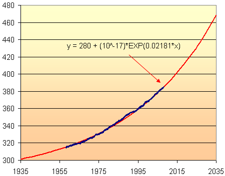
According to this model, the CO2 concentration in 2035 will be about 470 parts per million. This assumes that the current rate of increase will continue until 2035. But with India, China and Vietnam (and many other developing countries) hell-bent on "catching up with the West", it is likely to increase faster than this.
Why it Matters
Throughout the past 1 million years, the CO2 concentrations have ranged between 160 ppm (during ice ages) and were sitting around 280 ppm before the Industrial Revolution. (This information comes from examinations of Antarctic ice down to 3 km depth.) Current concentrations of around 380 ppm represent 869 gigatons (billion tons) of carbon in the air. [Source: The Weather Makers by Tim Flannery.]
The inevitable results of this increased carbon? More warming, more violent weather, more severe flooding and droughts, higher food prices, environmental refugees, etc.
Authentic Data
There is such a great deal of interesting authentic data out there. Why do math textbooks continue to use boring "nice" data (that is easy to plug into some formula) rather than real stuff that actually has meaning and matters?
Disclaimer
The above model is not a climate model as such. All I am doing is modelling the NOAA data as given so that I have a function that I can use for extrapolation. A real climate model will feed in all of the available data and will end up with a much more sophisticated model than this.
See also A simple climate change model.
Endpiece: Polynomial Model Limitations
My first attempts to get a good exponential model were not so successful, so I resorted to a polynomial model. Following is what it looked like.
I am usually reluctant to use a cubic polynomial model, because I find that they are often quite unrealistic either side of the data set and so cannot be used for extrapolation.
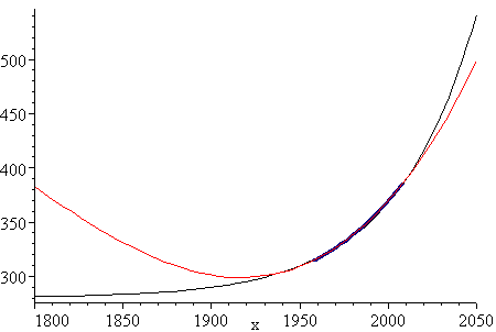
However, the following cubic polynomial model (obtained from an online regression utility which has since disappeared) looked very promising.
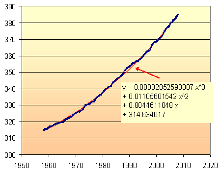
The fit is very good, as you can see. Around 1990 the CO2 increase was quite rapid (probably due to Mt Pinatubo's eruption in the Philippines) and you can see the (red) model graph sneaking through.
However, we can see the limitations of this model when we extrapolate too far beyond the 100 year period of 1935 to 2035.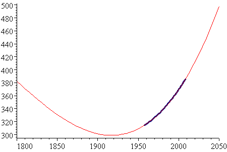
The period where data exists (1958 to 2008) is indicated on the graph (in dark blue). As you can see, the model is quite unrealistic to the left of the data set.
For interest, here is the same graph with the exponential model from above (in black). It is clearly a better model than the polynomial one.
See the 46 Comments below.