Visual.ly data visualization
By Murray Bourne, 18 Jul 2011
We are witnessing an explosion of data like the world has never seen - how to make sense of it all?
Visual.ly is a new data visualization tool that allows you to:
- Explore: You can "see the best infographics on the web all in one place"
- Share: Here you can upload your own infographics "to get exposure and feedback"
- Create: This part is still a work in progress, but you'll be able to upload your own data and create visualizations.
Some example graphics
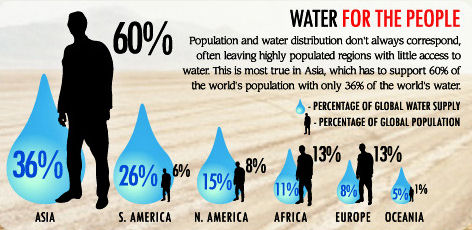
Here's an extract from an infographic on visuall.ly, Glass half empty - coming water wars, showing how there will be enormous pressure on water resources in Asia this century (since it represents 60% of the world's population but has only 36% of the world's water). The rest of the graphic suggests this may lead to water wars.

Other topics that caught my eye were: Mac person vs PC person (where we learn that "Mac people are 50% more likely than PC people to say they frequently throw parties") and The size of the mobile market (which claims Taiwan has the highest number of mobile phones per 100 people (at 106.45), and the US has 45.51, which is below the world average of 59.3. (Singapore is not included - I suspect it will be right near the top.)
Visual.ly's intro video
Here's Visual.ly's own rah-rah:
Reality check
- There were some clear errors in the graphics I looked at (like stating 4 billion is half the world's population - it isn't) and typo errors (like "Goggle").
- More importantly, very few of the infographics have a link to the data source. How do we know the data is accurate or reliable? How can we learn more?
- I noticed a few hiccups on the site (like broken images and the odd broken link).
Overall
Anything that takes dry, raw data and helps people to understand it is a Good Thing.
Visual.ly will crash and burn if users doubt the accuracy of what they see. They probably should instigate a review process, or at least insist that data sources are provided.
However, it's certainly worth watching this tool as it develops
See the 2 Comments below.
25 Jul 2011 at 11:16 pm [Comment permalink]
Call me "old-fashioned" but the Water Wars was the best (and only, IMHO) of all the visual.ly graphs that was superior in getting the message across, almost immediately.
The other 35 or so graphs I looked at were tedious, took me forever to get the point, and seemed to be over the top in style for the sole sake of being...over the top.
I totally agree it is a sign of better communication to use graphs to pass along information. I also loved your "Linkedin" before and after graphs as an example of better thought out presentation of facts.
The other graphs, though: back to the drawing board. They were like huge visual run-on sentences...boring.
Thanks for your time! Love your newsletter.
26 Jul 2011 at 6:53 am [Comment permalink]
@Jackie: Spot on and I agree with you. However, from an educational point of view, if students can use this tool to make more sense of the data they collect (or come across), then it serves a purpose.
Actually, I found the comments on each visualization to be more interesting than the visualizations!