7. Graphs on Logarithmic and Semi-Logarithmic Axes
by M. Bourne
Need Graph Paper?

In a semilogarithmic graph, one axis has a logarithmic scale and the other axis has a linear scale.
In log-log graphs, both axes have a logarithmic scale.
The idea here is we use semilog or log-log graph axes so we can more easily see details for small values of y as well as large values of y.
You can see some examples of semi-logarithmic graphs in this YouTube Traffic Rank graph.
See also air pressure and Zipf Distributions later on this page.
Semi-Logarithmic Graphs
In the following set of axes, the vertical scale is logarithmic (equal scale between powers of 10) and the horizontal scale is linear (even spaces between numbers).
There are no negative numbers on the y-axis, since we can only find the logarithm of positive numbers.
Semilogarithmic axes.
NOTE: The numbers on the y-axis become too close together near each integral power of 10, so they have been removed for readability.
Example 1: Graph of `y=x`
Let's see what the simple graph `y=x` looks like on different axis types.
a. `y=x` on Linear Axes
On ordinary linear axes, the graph of `y=x` is a straight line, passing through `(-2,-2)`, `(-1,-1)`, `(0,0)`, `(1,1)`, `(2,2)`, etc.
Graph of `y=x` on linear (lin-lin) axes.
b. `y=x` on Semi-logarithmic Axes (vertical axis logarithmic, horizontal axis linear)
On semi-logarithmic axes, the graph of `y=x` is a curve, not a straight line. It still passes through `(1,1)`, `(2,2)`, `(3,3)`, etc, but you'll notice there are no negative values for `y` (and so in this case, no negative values for `x` either) since we can't find the log of a negative number.
Graph of `y=x` on semilogarithmic (log-lin) axes.
I've marked the points `(1,1)`, `(2,2)`, `(3,3)`, `(4,4)` `(5,5)`, `(6,6)` on the curve.
c. `y=x` on Semi-logarithmic Axes (vertical axis linar, horizontal axis logarithmic)
Points along the curve `y=x` on lin-log axes.
I've marked the points `(1,1)`, `(2,2)`, `(3,3)` up to `(10,10)` on the curve.
Notice there are no negative values for `x` on a lin-log curve.
Semi-logarithmic graph examples
(a) Traffic charts
The popularity of the site imeem.com grew very rapidly in 2006/7. Here is Alexa's graph of that growth, using a linear horizontal scale (years) and a logarithmic verical scale for popularity rank (where rank=1 means most popular).
imeem was subsequently bought by MySpace.
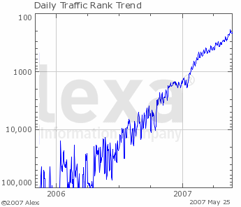
Rank of imeem over time.
(b) Financial charts
The financial industry makes use of semi-logarithmic scales to make charts easier to read. See this Gold prices chart as an example.
Example 2: Variable Exponent
We conducted some observations in an experiment involving growth of a microbial population at different temperatures and obtained data as follows:
| T (°C) | −2 | −1 | 0 | 1 | 2 | 3 | 4 |
| P | 0.020 | 0.143 | 1 | 7 | 49 | 343 | 2401 |
We observe the population increases by 7 times for each `1°` rise in temperature, so we can model the data using the function `P = 7^T`.
We plot the data on linear T-P axes as follows:
Graph of `P=7^T` on linear-linear axes.
Our plot shows reasonable detail for values of `x` greater than `1`, but doesn't tell us much for smaller values of `x` or `y`. The points are too close to the x-axis for us to see what is going on.
Let's now plot the same data on semi-logarithmic axes.
Graph of `P=7^T` on semilogarithmic axes.
Now we can see a lot more information for smaller values of `x` and `y`. This is the beauty of semi-logarithmic axis plots - you can see more detail in graphs where there is a very wide range of values, but some of the data is close together.
Example 3
Draw the graphs of `y=5^x` on linear and both types of semilogarithmic axes.
Answer
For reference, here is a table of values for `y=5^x`:
| x | −1 | 0 | 1 | 2 | 3 | 4 |
| y | 0.2 | 1 | 5 | 25 | 125 | 625 |
Here is the graph on linear x-y axes:
Graph of `y=5^x` on linear-linear axes.
Our plot shows reasonable detail for values of `x` greater than `1` only.
Here's the same data plotted on semi-logarithmic (log-lin) axes.
Graph of `y=5^x` on semilogarithmic (log-lin) axes.
You can see a lot more detail for smaller values of `x` and `y`.
Notice that the graph of an exponential function on a semi-log graph is a straight line.
Notice also that the numbers along the x axis are evenly spaced, while along the y-axis, we have powers of 10 evenly spaced.
Finally, here's the graph of `y=5^x` on lin-log (linear vertical axis, logarithmic horizontal axis).
Points along the curve `y=5^x` using lin-log axes.
In this example, there is not a lot of advantage in using this last semilogarithmic graph type, as we don't see much detail for values less than `1`.
Log-log Graphs
Log-log graphs use a logarithmic scale for both vertical and horizontal axes.
Here's the graph of `y=x` on log-log axes.
Points along the line `y=x` on log-log axes.
The above graph has the following points highlighted for clarity:
`(1, 1)`, `(2, 2)`, `(3, 3)`, `(4, 4)`, `(5, 5)`, `(6, 6)`, `(10, 10)`, and `(100, 100)`.
NOTE: Both the domain (x-values) and the range (y-values) must be POSITIVE, because you cannot have the logarithm of a negative number.
Population Example
We can also graph the population example we met earlier, `P = 7^T` on log-log paper (i.e. both axes use log scales):
Points along the curve `P=7^T` on log-log axes.
We can see even more detail for small values of x and y now, however we can't include the negative temperatures on the horizontal axis.
Example 4: Variable Raised to a Fractional Exponent
Graph y = x1/2 using all 4 axis types (rectangular, both types of semi-log, and log-log). This function is equivalent to `y=sqrt(x)`.
Answer
Rectangular axes plot
Using rectangular axes, we can see that the graph of y = x1/2 is half of a parabola on its side (i.e. the parabola's axis is horizontal):
Graph of `y=sqrt(x)` on linear axes.
We've seen this curve before, in The Parabola section.
Note 1: The detail near `(0, 0)` is not so good using a rectangular grid.
Note 2: The curve passes through `(0, 0)`, `(1, 1)`, `(4, 2)` and `(9, 3)`. In each case, the y-value is the square root of the x-value, which is to be expected.
Let's now see the curve using semi-logarithmic plots.
Logarithmic vertical axis, linear horizontal axis
Graph of `y=sqrt(x)` on semilogarithmic (log-lin) axes.
Now we have a lot better detail for small y. The lowest value of y that the graph indicates is `y = 0.1`. We can go lower than this, but cannot show `y = 0`, since the logarithm of `0` is not defined.
We can see that the curve still passes through `(1, 1)`, `(4, 2)` and `(9, 3)`.
Linear vertical axis, logarithmic horizontal axis
Points along the curve `y=sqrt(x)` using lin-log axes.
Logarithmic vertical axis, logarithmic horizontal axis (log-log) plot
Points along the curve `y=sqrt(x)` on log-log axes.
We observe that the graph of y = x1/2 is a straight line when graphed on log-log axes.
Once again our curve passes through `(1, 1)`, `(4, 2)` and `(9, 3)` (indicated by dots on the graph), as it should.
Application 1: Air pressure
1. By pumping, the air pressure in a tank is reduced by 18% each second. So the percentage of air pressure remaining at time `t` is given by p = 100(0.82)t.
Plot p against t for 0 < t < 30 s on
(a) a rectangular co-ordinate system
(b) a semilogarithmic system.
Answer
(a) Rectangular plot:
Graph of `y=100(0.82)^t` on linear axes.
(b) Semilogarithmic Plot:
Graph of `y=100(0.82)^t` on semilogarithmic axes.
Application 2: Zipf Distributions
Consider the most common words in English. It turns out that there is a relationship between the rank of a word's occurrence and the frequency of its use. That relationship was observed by George Kingsley Zipf in the first half of the 20th century.
The Zipf Distribution is an observation comparing rank and frequency of word occurrences. In general, the word with rank k has a frequency roughly proportional to `1/k`. In other words, the second most commonly used word occurs about `1/2` as often as the most common word. Likewise, the 3rd most common word occurs about `1/3` as often as the most common word.
Zipf Distributions occur naturally in many situations, for example in:
- Calls to computer operating systems
- Colors in images
- As the basis of most approaches to image compression
- City populations (a small number of large cities, a larger number of smaller cities)
- Wealth distribution (a small number of people have large amounts of money, large numbers of people have small amounts of money)
- Company size distribution
- Artificial intelligence (in particular, "chat bots" that can chat with humans) relies on the limited number of questions and statements that people actually write in chats.
a. Common English Words
Zipf originally developed his law in response to the observation that the frequency of words was inversely proportional to the rank of each word.
For example, the most common 20 words in English are listed in the following table. The table is based on the Brown Corpus, a careful study of a million words from a wide variety of sources including newspapers, books, magazines, fiction, government documents, comedy and academic publications.
The most common word, "the" occurred around `70,000` times (or `7%` of the million words counted). The next ranked word, "of", occurred around `3.6%` of the time (or about `1/2` as often as the top-ranked word.) The third most popular word was "and", with a frequency of `2.8%`, or roughly `1/3` of the frequency of the top ranked word.
| Rank | Word | Frequency | % Frequency | Theoretical Zipf Distribution |
|---|---|---|---|---|
| 1 | the | 69970 | 6.8872 | 69970 |
| 2 | of | 36410 | 3.5839 | 36470 |
| 3 | and | 28854 | 2.8401 | 24912 |
| 4 | to | 26154 | 2.5744 | 19009 |
| 5 | a | 23363 | 2.2996 | 15412 |
| 6 | in | 21345 | 2.1010 | 12985 |
| 7 | that | 10594 | 1.0428 | 11233 |
| 8 | is | 10102 | 0.9943 | 9908 |
| 9 | was | 9815 | 0.9661 | 8870 |
| 10 | he | 9542 | 0.9392 | 8033 |
| 11 | for | 9489 | 0.9340 | 7345 |
| 12 | it | 8760 | 0.8623 | 6768 |
| 13 | with | 7290 | 0.7176 | 6277 |
| 14 | as | 7251 | 0.7137 | 5855 |
| 15 | his | 6996 | 0.6886 | 5487 |
| 16 | on | 6742 | 0.6636 | 5164 |
| 17 | be | 6376 | 0.6276 | 4878 |
| 18 | at | 5377 | 0.5293 | 4623 |
| 19 | by | 5307 | 0.5224 | 4394 |
| 20 | I | 5180 | 0.5099 | 4187 |
(The first 20 words in the Brown Corpus, published in 1967. This Corpus is the count of how often one million words were used in a variety of books, newspapers and other publications. [Table source no longer available, but similar to Corpus of Contemporary American English.]
I have included the "Theoretical Zipf Distribution, based on the n-th ranked word occurring approximately `1/n` times the frequency of the highest ranked word. This gives us a hyperbola, that we met before.)
Let's plot what we have observed:
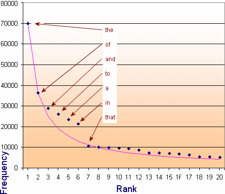
The dark blue data points represent the top 20 occurring English words (with the first few labeled). The pink line is the theoretical Zipf distribution, which is found to be `f/n^0.94`, where f is the frequency of the top-ranked word and n is the rank of the word.
`f/(1^0.94) = 69970`,
`f/2^0.94 = 69970/2^0.94 = 36470, `
`f/3^0.94 = 69970/3^0.94 = 24912,`
`f/4^0.94 = 69970/4^0.94 = 19009,`
`f/5^0.94 = 69970/5^0.94 = 15412, `
`...`
The power `0.94` comes from observing the best line of fit for the word frequencies. (I just did trial and error in Excel until I found the closes fit.)
There is a fairly large gap in the pattern for the words "to", "a" and "in", but it settles down and is quite consistent after that.
We now plot the top 2000 English words and use a log-log scale (log of the rank for the horizontal axis and log of the frequency for the vertical axis). If a distribution gives us a straight line on a log-log scale, then we can say that it is a Zipf Distribution.
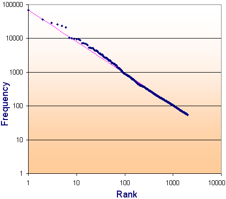
We see that there is a remarkably consistent result for the top 2000 most-used English words. For your information, the last few in the list of 2000 words are:
      1992nd	device
      1993rd	conduct
      1994th	runs
      1995th	improved
      1996th	games
      1997th	cultural
      1998th	plenty
      1999th	mile
      2000th	components
b. Websites and the Zipf Distribution
We also observe a Zipf Distribution when it comes to popularity of pages in Websites.
For example, out of a sample of 500,000 page views in Interactive Mathematics, the most commonly visited page was the homepage, with 27,855 views. The next most common page was the Algebra Introduction, with around 1/2 of the views. The 3rd ranked page had about 1/3 of the views of the most popular page.
| Rank | Page | Frequency (Page views) |
|---|---|---|
| 1 | Home | `27855` |
| 2 | Basic Algebra Introduction | `15334` |
| 3 | Addition & Subtraction in Algebra | `7605` |
| 4 | Math Of Beauty | `5965` |
| 5 | Graphs of Sine and Cosine | `5749` |
| 6 | Volume of Solid of Revolution | `5667` |
| 7 | Trigonometric Graphs Introduction | `5584` |
| 8 | Download LiveMath | `5517` |
| 9 | Introduction to Trigonometric Functions | `4701` |
| 10 | Sitemap | `4309` |
For the top 500 pages in the site, we have the following log-log graph of the page views:
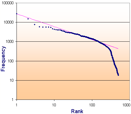
The theoretical Zipf Distribution (the pink line) is obtained as follows. The power used, 0.67, once again comes from observing the best line of fit.
`27855/2^0.67 = 17507`
`27855/3^0.67 = 13342`
`27855/4^0.67 = 11003`
`27855/5^0.67 = 9475`
`27855/6^0.67 = 8835 `
After the page ranked 200th, the pattern breaks down, but interestingly, from the 300th to the 500th page, there is still a consistent relationship between rank and frequency.
See also Zipf Distributions, log-log graphs and Site Statistics over in the IntMath blog.