6. Graphs of Functions Defined by Tables of Data
When performing an experiment, or observations, we'll have a table of values. If we graph the data, we can get a better insight into the relationship between our variables.
Such data values would indicate whether the variables are related (ie. have a formula that links them).
We have 2 possible situations:
- The data points can be joined by a smooth curve, because the values in between the given data points have meaning. An example would be temperatures taken at the beginning of each month. We would join these with a smooth curve because the temperature rises (or falls) during the month. Such data arises from measurement and is called "continuous" data.
- We need to use a bar graph (histogram) since the data is not "smooth". That is, the values between the given data points would have no meaning. An example of this case would be if we count a number of objects produced monthly by a factory. Such data is called "discrete".
Example 1
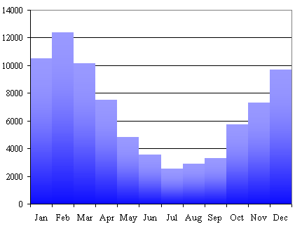
The number of ice creams produced by an Australian factory in each month is given in the following table (The hottest month is February):
| Month | Factory output |
|---|---|
| Jan | 10490 |
| Feb | 12325 |
| Mar | 10201 |
| Apr | 7496 |
| May | 4816 |
| Jun | 3678 |
| Jul | 2532 |
| Aug | 2890 |
| Sep | 3312 |
| Oct | 5754 |
| Nov | 7312 |
| Dec | 9690 |
Need Graph Paper?

Plot these data.
Answer
Since we are given the number of ice creams produced each month, there is no meaning to the intervals between the months. Therefore, a histogram is used. We don't join the data points with lines.
Example 2
Oil is collected from an engine and allowed to cool. Its temperature was recorded each minute as follows:
| Time (min) | Temp (°C) |
|---|---|
| 0.0 | 150.0 |
| 1.0 | 143.5 |
| 2.0 | 137.9 |
| 3.0 | 135.1 |
| 4.0 | 132.6 |
| 5.0 | 131.5 |
Plot the graph.
Answer
Since the temperature changes in a continuous way, there is meaning to the values in the intervals between the points. Therefore, the points are joined by a smooth curve.
Graph of data points.
Normally on the vertical axis we would start at 0 degrees and have evenly-spaced marks at 10 degree intervals. However, the curve would look almost flat if we did that and we would not be able to see the drop in temperature very easily.
The "squiggle" in the lower part of the `T`- (vertical) axis indicates the vertical scale doesn't start at `0`.
Estimating values
We can estimate values of one variable for given values of the other.
For instance, the temperature after `2.5` min can be estimated from the graph as `136°\ "C"` (magenta arrows below).
Estimating the temperature after 2.5 minutes.
Similarly, the time taken for the oil to cool down to `141.0°\ "C"` is estimated to be `1.4` min (gray arrows).
Estimating the time to cool to `141°C`.
Linear Interpolation
A more accurate way of estimating values from a graph is called linear interpolation.
Linear interpolation assumes that if a particular value lies between two of those listed in the table, then the corresponding value of the other variable is at the same proportional distance between the listed values.
Linear interpolation: Find `b` for some value `a` such that `x_1 < a < x_2`.
If we have 2 known points `(x_1, y_1)` and `(x_2, y_2)` and we want to find the interpolated value `b` at `x = a` (this value `a` is between `x=x_1` and `x=x_2`), we make use of the formula for slope of a line, and the fact the 2 triangles in the diagram above are in proportion, as follows:
`(y_2 - y_1)/(x_2 - x_1) = (b - y_1)/(a - x_1)`
Solving for `b` gives:
`b = y_1 + (y_2 - y_1)(a - x_1)/(x_2 - x_1)`
Let's see how this works in an example.
Example 3
Use linear interpolation to find the temperature of the oil after 1.4 min:
| Time (min) | 1.0 | 1.4 | 2.0 |
|---|---|---|---|
| Temp (°C) | 143.5 | ??? | 137.9 |
Answer
In this case, `(x_1, y_1) = (1,143.5)` and `(x_2, y_2) = (2, 137.9)`.
Using the method of proportions:
`b = y_1 + (y_2 - y_1)(a - x_1)/(x_2 - x_1)`
` = 143.5 + (137.9-143.5)(1.4-1.0)/(2.0-1.0)`
`= 143.5 + (-5.6)0.4/1.0`
` = 143.5 - 2.24`
` = 141.3^@\ "C"`
This is the estimate of the temperature after `1.4\ "min"` using linear interpolation.
Exercise
In a biology lab, an experimenter observes the rate of growth of a bacteria colony at various temperatures, as shown in the table.
| Temp (°C) | Rate (mg/min) |
|---|---|
| 20 | 0.21 |
| 30 | 0.30 |
| 40 | 0.37 |
| 50 | 0.45 |
| 60 | 0.52 |
| 70 | 0.57 |
| 80 | 0.62 |
By means of linear interpolation find the rate for temp = 36°.
Answer
We extract one portion of the table and add our required unknown, as follows:
| Temp | 30 | 36 | 40 |
|---|---|---|---|
| Rate | 0.30 | ?? | 0.37 |
Using proportions again, we have:
`b = y_1 + (y_2 - y_1)(a - x_1)/(x_2 - x_1)`
` = 0.30 + (0.37-0.30)(36-30)/(40-30)`
`= 0.30 + (0.07)(6/10)`
` = 0.30 + 0.042`
` = 0.342\ "mg/min"`
So the required value is:
Rate `= 0.342\ "mg/min"`.