CSS Matrix - a mathematical explanation
This article gives an overview of CSS transforms, and explains how they can be replaced using a single transform with CSS matrix. It shows where the numbers come from in CSS matrix, the result of matrix multiplication.

Important gotcha - transform-origin
Before talking about transforms and matrices, we'll briefly describe the important concept of transform-origin – this is something that can easily bite you in the tail. It's quite possible to have an object disappear right off the screen when performing a simple transform, and often the culprit is the origin of the transform has not been set, or has been set differently to what you expect.
For each of these examples, we're going to rotate the image (clockwise) by 20o. However, they all have different transform-origins.
Click on each picture to see how the transform is different for different transform-origins.
transform:rotate(20deg)
The browser default is transform-origin:50% 50%, and it means the image will rotate around its center, while "transform-origin:0 0" means it will rotate around the top left of the picture.
Default

transform-origin:0 0
"100% 100%" means the image will rotate around its bottom right corner, while I set "126px 52px" so it rotates around a key focus of the image.
transform-origin:100% 100%
transform-origin:126px 52px
For the rest of the examples on this page, the transform-origin is set to 0 0 (top left).
CSS transform examples
Before we see what CSS matrix can do for us, here's a quick reminder of some of the main transforms, and how we achieve them using CSS.
We start with an immortal quote by Morpheus from The Matrix. It's contained in a <div> with a border. We're going to perform six transforms on this <div>.
Original div
"This is your last chance. After this, there is no turning back."
—Morpheus

First we apply scaleX(2) which stretches the whole thing by 2 in the x-direction; then in (b) we start again and this time skew it in the y-direction by 10o.
You can see the (greyed out) original <div> underneath, for comparison.
(a) transform: scaleX(2)
"This is your last chance. After this, there is no turning back."
—Morpheus
"This is your last chance. After this, there is no turning back."
—Morpheus
(b) transform: skewY(10deg)
"This is your last chance. After this, there is no turning back."
—Morpheus
"This is your last chance. After this, there is no turning back."
—Morpheus
Next, we'll skew the original <div> in the x-direction by 15o and then start over in (d) and scale it by 1.4 in the y-direction.
We're doing these in a strange order and I hope the reason for it will become clear soon.
(c) transform: skewX(15deg)
"This is your last chance. After this, there is no turning back."
—Morpheus
"This is your last chance. After this, there is no turning back."
—Morpheus
(d) transform: scaleY(1.4)
"This is your last chance. After this, there is no turning back."
—Morpheus
"This is your last chance. After this, there is no turning back."
—Morpheus
Finally, we translate (simply move) the <div> in the x-direction by 150 px and then by 50 px in the y-direction (positive is down for CSS transforms.)
(e) transform: translateX(150px)
"This is your last chance. After this, there is no turning back."
—Morpheus
"This is your last chance. After this, there is no turning back."
—Morpheus
(f) transform: translateY(50px)
"This is your last chance. After this, there is no turning back."
—Morpheus
"This is your last chance. After this, there is no turning back."
—Morpheus
Does the order of transforms matter?
Observe the following two examples. In the first one, (g), we rotate the <div> first, then we scale it in the x-direction. Notice the sides of the transformed <div> do not meet at right angles.
In the second one, (h), the scaleX(0.6) happens first, and then the rotation. This time, the sides meet at right angles, and the transformed <div> is "skinny".
(g) transform: scaleX(0.6) rotate(-120deg)
"This is your last chance. After this, there is no turning back."
—Morpheus
"This is your last chance. After this, there is no turning back."
—Morpheus
(h) transform: rotate(-120deg) scaleX(0.6)
"This is your last chance. After this, there is no turning back."
—Morpheus
"This is your last chance. After this, there is no turning back."
—Morpheus
So the order of transforms does matter. (In mathematical language, we say they are not commutative.) We'll see soon that this is because matrix multiplication is generally not commutative, and these transforms are the result of (internal) matrix multiplications.
CSS Matrix elements
The CSS transform matrix consists of 6 numbers, as mentioned earlier.
Some resources (like Quackit's CSS matrix() Function) give the misleading information that the numbers in a transform matrix are as follows:
However, this only applies if we are doing one transform at a time.
Before showing how this is misleading, let's go through some simple matrix examples first.
The "unit" transform matrix
A transform matrix that does not change the shape, size or position in any way would be written as:
transform: matrix(1, 0, 0, 1, 0, 0)
The numbers in the scaleX and scaleY positions are both 1 (we are not changing the size), and skewY and skewX are 0 (we are not skewing the object at all), and finally, translateX and translateY are 0, so we are not moving the object anywhere.
Writing single transforms using CSS matrix
The first transform we did, scaleX(2) can be written as:
transform: matrix(2, 0, 0, 1, 0, 0)
Similarly, the second transform we did, skewY(10o) can be written as (matrix uses the tan of the angle):
transform: matrix(1, 0.1745, 0, 1, 0, 0)
The third transform we did, skewX(15o) can be written as (once again, matrix uses the tan of the angle):
transform: matrix(1, 0, 0.2618, 1, 0, 0)
The fourth transform we did, scaleY(1.4) can be written as:
transform: matrix(1, 0, 0, 1.4, 0, 0)
The fifth transform we did, translateX(150px) can be written (without the px units) as:
transform: matrix(1, 0, 0, 1, 150, 0)
The last transform we did, translateY(50px) can be written (without the px units) as:
transform: matrix(1, 0, 0, 1, 0, 50)
Notice we are doing one transform only in each case.
What if we want to apply all of the transforms together?
Earlier. we applied 6 different transforms, one after the other (in examples (a) to (f)), in this order:
scaleX(2),skewY(10deg),skewX(15deg),scaleY(1.4),translateX(150px),translateY(50px)
If we want the browser to apply all 6 transforms, in that order but all at once, we need to present them in our CSS in REVERSE order (since the browser applies them in the order right to left), like this:
transform: translateY(50px) translateX(150px) scaleY(1.4) skewX(15deg) skewY(10deg) scaleX(2)
Combined CSS transforms
Here's the result of applying all 6 transforms "at once".
(i) transform: translateY(50px) translateX(150px) scaleY(1.4) skewX(15deg) skewY(10deg) scaleX(2)
"This is your last chance. After this, there is no turning back."
—Morpheus
"This is your last chance. After this, there is no turning back."
—Morpheus
Translation requires a 3×3 matrix
Our 2×2 matrix does not yet cater for translation. As we learned in Matrices and Linear Transformations, we need to use a 3×3 matrix for this.
Substituting what we've done so far into the top-left position of a 3×3 matrix:
`[(\color(#f0f)2.0945,\color(#00f)0.2679,"translateX"),(\color(#00f)0.4937,\color(#f0f)1.4,"translateY"),(0,0,1)]`
In our example translateX is 150 px and translateY is 50 px, so we'll have:
`[(\color(#f0f)2.0945,\color(#00f)0.2679,150),(\color(#00f)0.4937,\color(#f0f)1.4,50),(0,0,1)]`
The last row of our (mathematical) matrix is a "dummy" row that always has values 0, 0, 1.
Finally we now know where the numbers are coming from in a CSS matrix. Reading down the columns, we have:
transform: matrix(2.0945, 0.4937, 0.2679, 1.4, 150, 50)
Unit transform matrix
The mathematical way of writing a matrix that doesn't change the object in any way (a "unit transform matrix") is as follows:
`[(\color(#f0f)1,\color(#00f)0,0),(\color(#00f)0,\color(#f0f)1,0),(0,0,1)]`
Applying CSS matrix instead of separate transforms
After all that, we apply the matrix we've been discussing, and find the end result is indeed the same as transform (i), as expected.
(j) transform: matrix(2.0945, 0.4937, 0.2679, 1.4, 150, 50)
"This is your last chance. After this, there is no turning back."
—Morpheus
"This is your last chance. After this, there is no turning back."
—Morpheus
What are the easiest ways to calculate CSS matrix?
Example: title slide
This was the title slide (reproduced from above) I used in a talk on this topic recently. The title text is made to look like it is actually on the billboard. To make it look realistic, I needed to apply a 3D transform.
Useful CSS matrix tools
Of course, we don't need to calculate such matrices as the browser does it for us "under the hood". However, there are times where we want to apply a matrix but don't know the exact scale, skew and so on.
Here are some tools that help in the process.
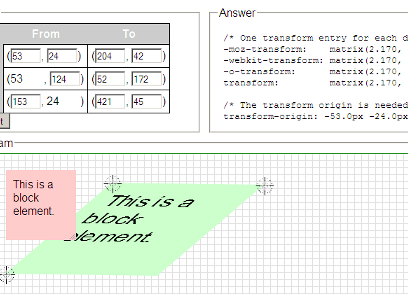
(1) The CSS3 Matrix Construction Set (by UserAgentMan)
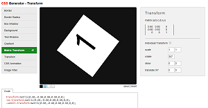
(2) CSS Generator - Transform (AngryTools)
This one is interesting but it makes no mention of the tangent ratio involved in the skew transformation, so it wasn't clear whether the slider was in degrees, radians or what. (It's not the angle, it's the result of taking the tan of an angle.)
(3) CSS Generator - Transform (ds-overdesign)

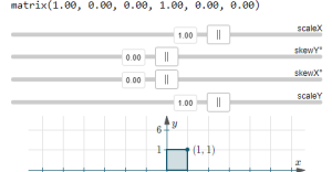
CSS matrix interactive applet (IntMath)
This is my own, and I hope it's useful.
Matrices and SVG
Matrix-based transforms work similarly to HTML CSS matrix transforms, except:
transform-origin: is at top-left of the element, not in the middle as in HTML, all except Firefox, that has it at middle (this has been an on and off "bug" since 2014).
SVG example using matrix transforms: Eigenvectors concepts
Further Resources
Understanding the CSS Transforms Matrix (Opera - one of the best)
The CSS3 matrix() Transform for the Mathematically Challenged (User Agent Man - quite good mathematical explanation)
An Introduction to CSS 3-D Transforms (David DeSandro - good examples)
CSS matrix() Function (Quackit - some misleading information)