Moiré Effect
Page by Murray Bourne, IntMath.com. Last updated: 07 September 2019.
You may have noticed the following pattern when watching a video of someone with a striped shirt.
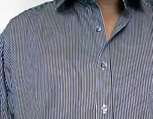
This is called the Moire Effect (or aliasing) and since it's very distracting, most (sensible) TV presenters wear plain clothing.
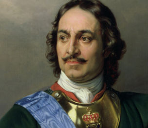
However, sometimes it is a desired effect, and throughout history clothing has been designed to deliberately shimmer, like this image of Peter the Great wearing a moire ribbon sash:
Below, we'll create a circular rotating moire effect using some quite simple coding.
Background
We create a circle, place stripes on it and rotate it slowly, as follows:
Next, we create another set of stripes, place them over the first and rotate them slowly, slightly out of phase, as follows:
We keep on adding striped layers (7 in total) and rotate them slightly out of phase with one another. We get the resulting Moiré effect animation.
The animation
The math
The resulting patterns can be thought of as a composite trigonometric graphs scenario, where we are adding graphs that are slightly out of phase. In the case of sound, this results in "beating", where the sound starts to pulsate.
We start with y = sin(x − 20o).
Sine curve, displaced by 20o.
We add another curve on top, y = sin(x − 40o).
A second sine curve, displaced by 40o.
We keep going until we have 7 such curves.
When these are animated at slightly different rates and added, we get a shimmering effect, which we saw above.
(Read more about Composite Trigonometric Graphs.)
The code
The Moiré effect animations you see above do not use any javascript - it is pure CSS (cascading style sheets). This means it is very smooth and uses up very little CPU and thus battery power.
The stripes are achieved using linear gradients:
background-image: repeating-linear-gradient(transparent, transparent 5px, #165a71 5px, #165a71 7px);
Each additional <div> that's added starts off being 20o out of phase with the previous one, via this line:
transform: rotate(20deg);
The animated rotations ("rot") are achieved using the following:
@keyframes rot {
  0%{transform: rotate(20deg)}
  100%{transform: rotate(380deg)}
}
along with this line:
animation: 120s rot linear infinite;
The circles are achieved using: border-radius: 50%;.
Here is all the CSS that is involved:
Complete CSS
.wrapper{margin:0 auto;padding:2em;overflow:hidden}
.wrapper div {
  width: 100%;
  height: 100%;
  border-radius: 50%;
  transform: rotate(20deg);
  background-image: repeating-linear-gradient(transparent, transparent 5px, #165a71 5px, #165a71 7px);
  animation: 120s rot linear infinite;
}
.wrapper div:first-child{box-shadow: 0px 0px 20px 10px rgba(0,30,30,0.15)}
@keyframes rot {
  0%{transform: rotate(20deg)}
  100%{transform: rotate(380deg)}
}
@media all and (max-width:599px){
  .wrapper{width:260px;height:260px}
  pre{margin:0;white-space:pre-wrap}
}
@media all and (min-width:600px){
  .wrapper{width:400px;height:400px}
}
.expl .wrapper{width:150px;height:150px}
Credits
The concept and CSS are by Gabriel Cyrillo, source: CodePen.
Moire shirt image: Shirt video
Peter the Great image: Moire ribbon sash
#/media/File:Peter_der-Grosse_1838.jpg)