Great statistics - gapminder
By Murray Bourne, 25 Aug 2006
Do yourself a favour and check out the brilliant animated presentations of data at: Gapminder. I love Gapminder's vision:
Making sense of the world by having fun with statistics!
From their About page:
Gapminder is a non-profit venture for development and provision of free software that visualise human development. This is done in collaboration with universities, UN organisations, public agencies and non-governmental organisations.
The video intro on Gapminder's data visualization by the enthusiastic Hans Rosling is a good place to start.
Here is an example, showing Egypt's child survival rate improvement from 1960 to 2003, compared to per capita GDP.
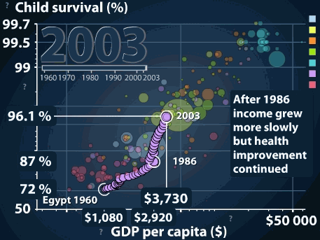
From Third World to First
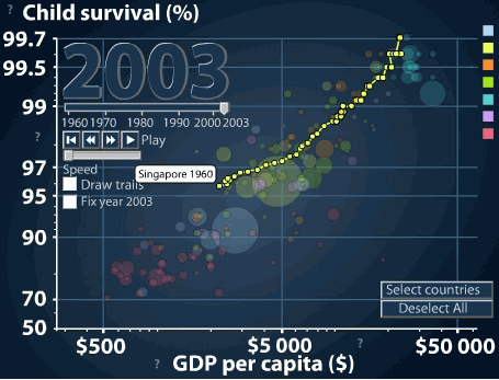
You can see Singapore's dramatic improvement in living conditions since the 1960s (the yellow dots represent stats for each year. Up and right is good.):
A lot of their visualizations are free to download. I love it.
Be the first to comment below.